Material Design, but make it Google

A collage showing a variety of Google products before the Google Material initiative

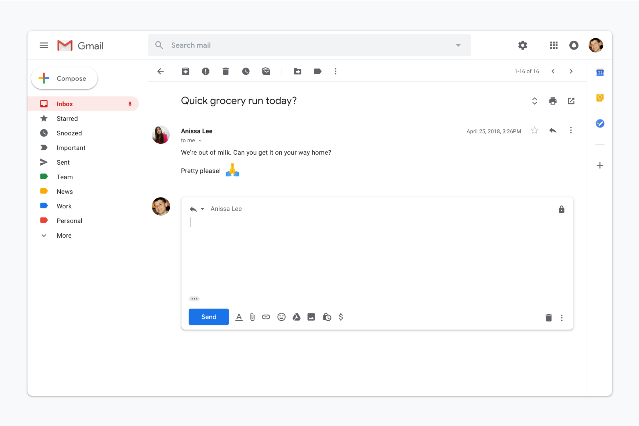
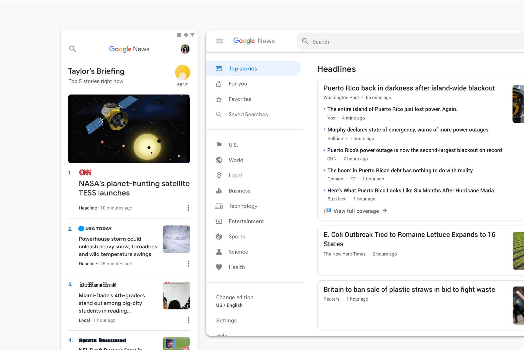
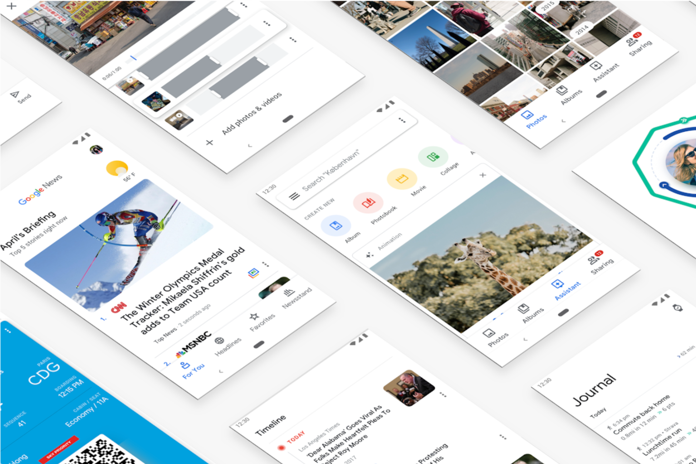
In 2018, Google launched 'Google Material,' a year-long, company-wide initiative to infuse Google's distinct personality and branding into its product ecosystem. This undertaking addressed the challenge of Material Design's widespread third-party adoption, which had led to a lack of visual distinction between Google's flagship applications and other apps.

I joined Material Design to lead this adoption push, a monumental undertaking encompassing hundreds of Google products with unique scales and usage. This involved identifying the diverse product range to ensure the design system provided universal benefit, followed by the intricate work of creating robust, cross-platform components. These components were engineered to handle complex demands such as accessibility and internationalization, critical considerations for products serving billions of users.

A visual representation highlighting the build from white principle

Managing the rollout was a logistical feat. We segmented products, prioritizing consumer flagships with high user traffic. Meticulous tracking evolved from Google Sheets to a Salesforce CRM, supported by detailed documentation and decks monitoring progress, risks, and adoption trends. This culminated in a detailed scoring system, which held products to high standards and provided actionable insights for future adoption, framing a short-term objective with long-term benefits.

My approach to gaining buy-in from countless stakeholders was simple: build strong, trusting relationships through demonstrated competence and reliability. The program ultimately succeeded in its goal: bringing Google's products closer together through a coherent, branded style.

A visual representation highlighting the build from white principle