Google Search logo update

A visual representation highlighting the build from white principle

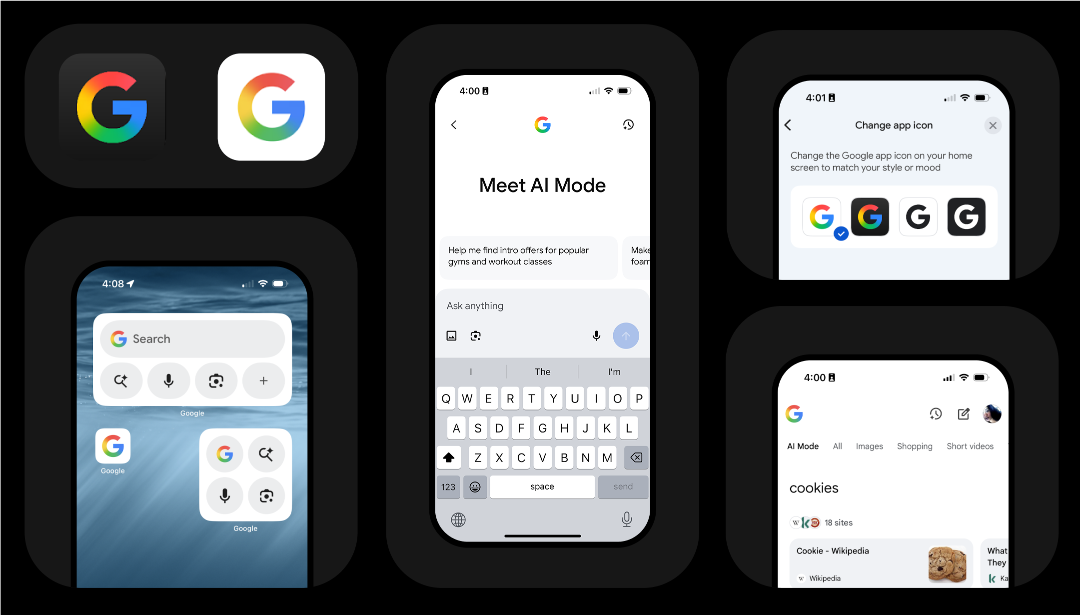
Recently, Google updated its iconic 'G' logo for Search, moving to a modern gradient from the original segmented four-color version. This wasn't a simple visual tweak; it was a significant step, landing 10 years after the last logo change. The new 'G' feels remarkably fresh, signaling Google's excitement for the AI era – clean, modern, and imbued with a sense of fun and helpfulness. I lead the adoption of this new logo across Google Search, Google's most prominent product.

This effort presented unique challenges. Search is a truly massive product, developed by hundreds of designers and engineers across a deeply distributed organization. Many teams independently own specific UI surfaces, making coordination an art more than a science. The timeline was demanding: the entire transition happened within a matter of weeks.

A visual representation highlighting the build from white principle

My team prioritized clear communication channels and streamlined workflows to ensure every instance of the original 'G' was tracked and replaced accurately and consistently. I was often engaged at the exec level in the morning and working with our eng teams on precise hex values to ship perfect assets in the evening – a real demonstration of flying at different altitudes to deliver on the goal.

Ultimately, the reception to the new 'G' logo has been overwhelmingly positive. The internet seems to genuinely love it, and the change positions Google beautifully for the future. It was a project that reinforced the impact of cohesive design and the power of precise execution.

A visual representation highlighting the build from white principle