Android essential apps

A visual representation highlighting the build from white principle

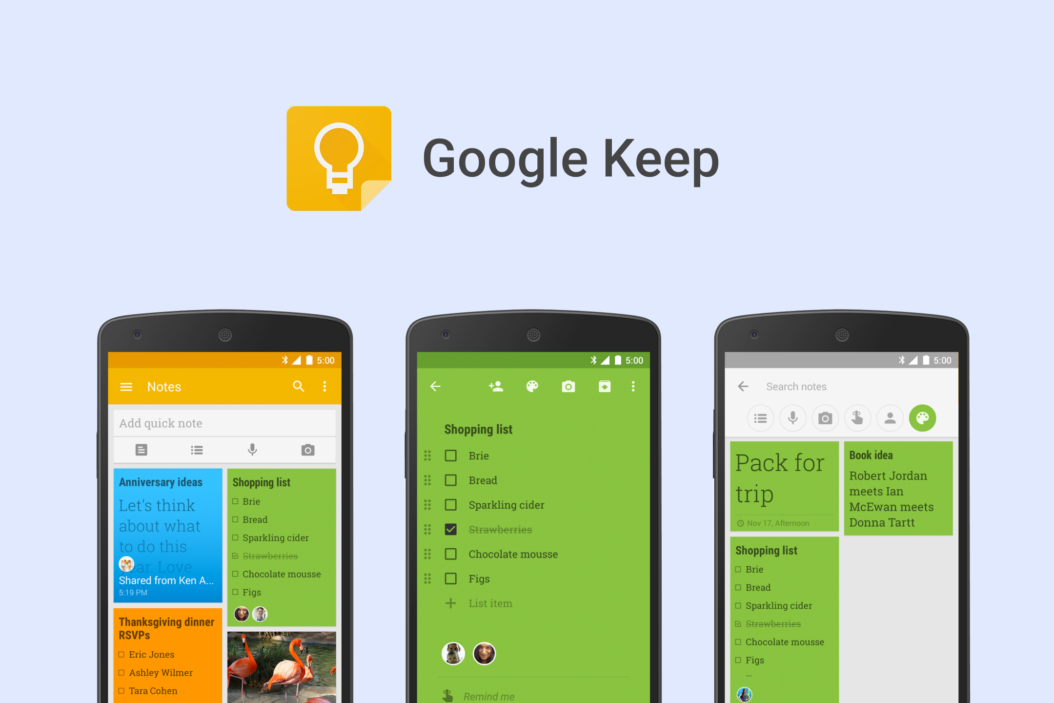
I spent 4 years as a visual designer on Android, and a big chunk of that time was dedicated to Google Keep. It's still Pixel's default note-taking app and, looking at it today, it largely reflects the design work I shipped during my tenure. This experience was truly where I learned what it takes to design an Android app for hundreds of millions of users.

Coming from a startup I had some Android design experience, but at Google everything was on a different scale. I got to dive deep into user research data to solve really complex problems. Building for such a vast array of devices, unlike the more focused approach at a startup, forced me to become an expert in things like screen densities, color spaces, and Android typography. Most importantly, it honed my skills in collaborating with engineering to ensure designs came to life exactly as intended.

A visual representation highlighting the build from white principle

Working with engineers on Keep was genuinely one of my favorite parts. I'd built good relationships with eng teams before, but with Keep, it became central to my workflow. There’s something special about that trusting connection with engineers; it makes them willing to question technical constraints and helps me, as a designer, better understand how those constraints can actually guide the most effective design solutions.

Beyond Keep, I also designed the initial versions of Google Fit and Android Things, and contributed to core apps like Calculator, Clock, and Camera. Across all these projects, I applied the very first version of Material Design – an experience that I believe set me up uniquely to become Material’s lead of UX Engagement. While on Android I created new UI and patterns to address unique user needs and, in turn, helped the design system itself grow.

A grid of app icons on an Android device, with Google Keep and Google Fit icons in the center